Hey there, have you ever wondered about the air quality in your neighborhood? Maybe you have allergies or asthma and want to plan your outdoor activities wisely. Good news checking the air quality is now as easy as opening the Google Maps app on your phone. Google recently added a new air quality layer to Google Maps that provides real-time air quality information for locations around the world. With just a few taps, you can see the current air quality index, pollutant levels and health recommendations for wherever you are. Whether you’re at home, at work or traveling somewhere new, this feature can help you make informed decisions about when and where to spend time outside. Read on to learn how to check the air quality for your current location or anywhere else on Google Maps.
Why You Should Check the Air Quality
Checking the air quality in your area is something you should do regularly, especially if you spend a lot of time outside. Here are a few reasons why:
- Your health. Polluted air can irritate your eyes and respiratory system, and long term exposure is linked to serious health issues like asthma, lung disease and even cancer. Knowing the daily air quality forecast helps you plan outdoor activities on days with the cleanest air or take precautions on polluted days.
- Environmental awareness. Monitoring air pollution in your city or town helps raise awareness about this important issue. The more people check air quality data, the more local governments and agencies will prioritize finding solutions. Every bit of data and every voice matters.
- Activity planning. If high levels of ozone or particle pollution are forecast for the next few days, you may want to reschedule strenuous outdoor exercise or activities. Sensitive groups like children, the elderly and those with respiratory problems are especially at risk on poor air quality days.
- Be an informed citizen. Understanding the state of the air in your community empowers you to make changes, whether through individual actions like driving less or community initiatives to reduce emissions. You can’t improve what you don’t measure, so checking your local air quality data is a good first step.
Using the air quality data and forecast tools on Google Maps, you’ll get current and projected conditions for pollutants like ozone, PM 2.5 and nitrogen dioxide. Simply search for “air quality” and your location to view easy-to-understand color-coded levels from good to hazardous so you know how clean or polluted the air is, and whether outdoor activities should be limited. Knowledge is power, so check in regularly on the quality of the air you breathe every day.
How to Enable the Air Quality Layer in Google Maps

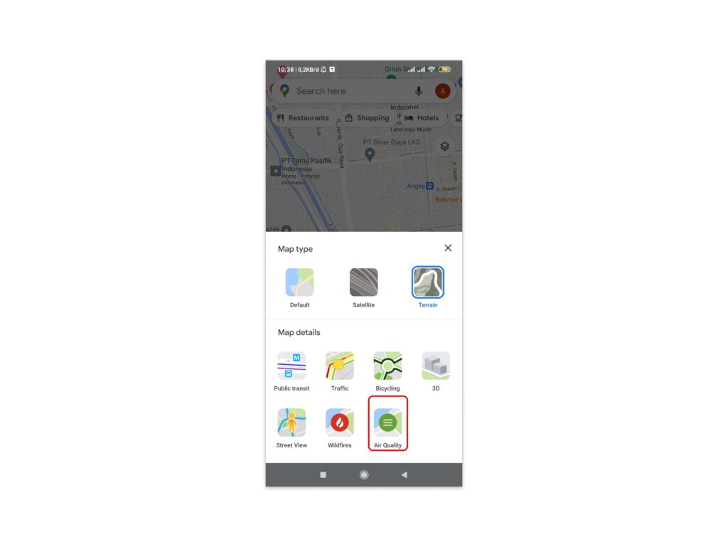
To enable the air quality layer in Google Maps and see pollution levels in your area, follow these steps:
- Open the Google Maps app on your iPhone or Android phone.
- Tap the menu button — the three stacked lines in the top left corner of the screen. This opens the Google Maps menu.
- Scroll down and tap “Air quality”. This will bring up the air quality settings screen.
- Toggle the “Air quality layer” option on. This will enable the air quality layer in Google Maps.
- Zoom in and out on the map to see the air quality in different locations. The air quality is shown using a color-coded scale, with red indicating hazardous, orange unhealthy, and green good quality air.
- Tap on a specific location to see the current air quality index or AQI for that spot. The AQI will tell you exactly how clean or polluted the air is. An AQI below 50 is considered good, while anything above 100 is unhealthy for sensitive groups.
- To turn off the air quality layer, just go back to the air quality settings and toggle the “Air quality layer” option off.
By enabling this useful feature in Google Maps, you’ll have a better sense of the environmental health of places you visit often or plan to travel to. While we can’t control air pollution, we can make informed decisions to limit exposure when possible. Every bit helps in the fight for cleaner air!
Understanding the Color-Coding for Air Quality in Google Maps
To understand the air quality data on Google Maps, you’ll need to get familiar with their color-coding system. The colors indicate the concentration of pollutants in a location and how it compares to World Health Organization guidelines.
Green – Good
If the air quality indicator is green, pollution levels are within WHO guidelines and the air quality can be considered good. At this level, air pollution poses little to no health risk. Enjoy your usual outdoor activities!
Yellow – Moderate
A yellow indicator means pollution levels are moderately high. Certain sensitive groups like the young, elderly, and those with respiratory or heart disease may experience health effects. Limit prolonged outdoor exertion if you experience symptoms like coughing or chest tightness.
Orange – Unhealthy for Sensitive Groups
When the air quality turns orange, pollution has reached unhealthy levels for sensitive groups. Sensitive groups should avoid prolonged outdoor exertion altogether. The general population may also experience irritation symptoms, so limit prolonged outdoor activities when possible.
Red – Unhealthy
A red indicator means the air quality has deteriorated to unhealthy levels for all groups. Everyone should limit prolonged outdoor exertion as pollution can have significant health effects at this range. Consider rescheduling strenuous activities to another day or time.
Purple – Very Unhealthy
Deep purple is the second highest air pollution level and means the air is very unhealthy for all groups. Everyone should avoid prolonged outdoor exertion altogether when the air quality is in the purple. Stay indoors as much as possible and run an air purifier if you have one.
Maroon – Hazardous
Maroon is the highest and most hazardous air pollution level. Health warnings of emergency conditions are issued by local agencies at this level. Everyone should avoid all outdoor activity and remain indoors. Follow instructions from local health officials regarding any evacuation or shelter in place orders.
Staying aware of your local air quality conditions and taking appropriate precautions will help reduce health risks from air pollution. Check Google Maps or your local government website for daily air quality updates and forecasts in your area.
The Types of Pollutants Tracked in the Air Quality Layer
Google Maps allows you to check the air quality in your area so you can see what pollutants are present and in what concentrations. There are six main pollutants tracked in the air quality layer.
Particulate matter (PM2.5 and PM10)
Particulate matter refers to tiny particles suspended in the air, including smoke, dust, and liquid droplets. PM2.5 particles are 2.5 microns or less in diameter, small enough to enter the lungs. Exposure to high levels of PM2.5 can cause respiratory issues and other health problems. PM10 particles are 10 microns or less and can also irritate your eyes, nose, and throat.
Nitrogen dioxide (NO2)
NO2 forms when fuel is burned at high temperatures. It can cause respiratory inflammation and reduced lung function, especially in at-risk groups like children, the elderly, and people with asthma. NO2 is one of the main pollutants emitted by vehicles and power plants.
Sulfur dioxide (SO2)
SO2 is a colorless gas with a sharp odor. It is produced by coal combustion, oil refining, and metal smelting. Exposure to high SO2 levels can lead to respiratory illness, especially in children and the elderly.
Carbon monoxide (CO)
CO is a colorless, odorless gas produced by incomplete combustion of fuels like natural gas, propane, oil, kerosene, and wood. At high levels, CO exposure reduces the amount of oxygen carried in the bloodstream, which can lead to impaired thinking, vision problems, and coordination loss.
Ozone (O3)
O3 occurs naturally in the upper atmosphere but at ground level, it forms in the presence of sunlight and precursor pollutants like NOx and VOCs. Exposure to ozone can cause chest pain, coughing, throat irritation, and congestion. It also worsens bronchitis, emphysema, and asthma.
Checking your local air quality on Google Maps and reducing activity on high pollution days is one way to limit your exposure to these pollutants. Be sure to also follow any alerts issued in your area.
Read Also : Ultimate Guide Taking Quality Photos with Your Smartphone
Limitations of the Air Quality Data in Google Maps
While the air quality data in Google Maps can be helpful, there are some limitations to be aware of.
Coverage
Google Maps air quality information currently only covers certain areas. Many smaller cities and rural locations are not monitored. The data comes from government air quality monitoring stations, so if there isn’t a station in the area, no data will be available. Over time, more locations are being added, but there will always be some areas without coverage.
Accuracy
The data provided is only as accurate as the monitoring equipment being used. Some stations provide more detailed information than others. The readings can also be impacted by factors like the station’s proximity to pollution sources. So, the levels reported may be higher or lower than what you’re actually exposed to at a given location.
Real-time updates
The air quality data in Google Maps is not live or real-time. It can take several hours for the latest readings to appear in the app. Conditions may have changed in that time period. For the most up-to-the-minute air quality information, check with your local air quality management district’s website or mobile app.
Pollutants reported
Google Maps only reports on a few of the most common air pollutants like ozone, nitrogen dioxide, sulfur dioxide and particulate matter (PM 2.5 and PM 10). Other potentially harmful pollutants like carbon monoxide are not included. So, while the data can indicate if the overall air quality is good or unhealthy, it doesn’t give a complete picture of what’s in the air.
The air quality feature in Google Maps provides a helpful snapshot of pollution levels in many areas. But for the most comprehensive and accurate information, it’s best to check other official sources for air quality data and reports about your local airshed. Knowing the limitations of the Google Maps data will allow you to better understand the information it provides and make the best decisions for your health based on current conditions.
In conclusion, Google Maps offers a user-friendly and convenient method to check air quality in various locations. By integrating air quality data into its platform, Google Maps empowers users to make informed decisions about their daily activities and well-being. With just a few simple steps, individuals can access real-time air quality information, including pollution levels and air quality indices.
By utilizing the air quality feature on Google Maps, users can stay aware of potential health risks associated with air pollution. This information is especially valuable for individuals with respiratory conditions or those who are sensitive to poor air quality. Moreover, it enables people to plan their outdoor activities accordingly, choosing routes or destinations with better air quality.
In summary, Google Maps’ air quality feature equips users with valuable information, promotes personal well-being, and supports collective efforts to combat air pollution. By incorporating air quality data into their daily routines, individuals can make more informed choices and contribute to a healthier and more sustainable future.


